El Niño and La Niña, sulfur atmospheric reflection, economic impacts, Pakistani weather, no climate refugees in Brazil, turbulence is normal Secretary Buttigieg, tornadoes normal, oceans normal, wildfires normal, Venezuelan glaciers and more.
The classification of El Niño events, including the strength labels, is somewhat subjective and can vary among meteorological and climate agencies. There isn’t a strict rule defining the specific number of consecutive Oceanic Niño Index (ONI) values that must be 2.0°C or above to categorize an El Niño event as “Super Strong.”
In general, a strong El Niño event is often characterized by ONI values reaching or exceeding +2.0°C. A Super Strong El Niño would typically involve sustained ONI value of +2.0°C or more. Hence for ease of understanding and comparing the strength of various Strong El Nino events, I propose to define an El Nino as a Super Strong event if three consecutive ONI index is +2.0°C or more.
A brief history of the past El Nino events with the number of consecutive ONI +2.0°C or above:
In the year 1965 the highest ONI index during that El Nino were SON +2.0°C, OND +2.0°C
In the year 1972-73 the highest ONI index during that El Nino were OND +2.1°C NDJ +2.1°C DJF
In the year 1982-83 the highest ONI index during that El Nino were SON +2.0°C, OND +2.2°C NDJ +2.2°C DJF +2.2°C
In the year 1997-98 the highest ONI index during that El Nino were ASO +2.1°C SON +2.3°C, OND +2.4°C NDJ +2.4°C DJF +2.2°C
In the year 2015-16 the highest ONI index during that El Nino were ASO +2.2°C SON +2.4°C, OND +2.6°C NDJ +2.6°C DJF +2.5°C JFM +2.1°C
ONI Data has been obtained from CPC – NWS – NOAA available here There have been three Super Strong El Nino events from 1950 onwards till date. The first such event was 1982-83 Super Strong El Nino with 4 consecutive ONI +2.0°C or above with highest ONI of +2.2°C twice. The second Super Strong El Nino event was 1997-98 with five consecutive ONI +2.0°C or above with highest ONI of +2.4°C twice. The third Super Strong El Nino event was 2015-16 with six consecutive ONI +2.0°C or above with highest ONI of +2.6°C twice. The current forecast and analysis does not support the 2023-24 El Nino to become a Super Strong El Nino.
Indian Monsoon & Enso relationship for India:
Based on earlier more than 100 years weather Data for Indian Summer Monsoon, The Average Rainfall in an El Nino years is 94% of LPA while in La Nina Years it has been 106 % of LPA for the whole country. Monsoon Rainfall over India had been +94.4% of LPA at the end of 30th September 2023. El Nino or La Nina may affect the Monsoon differently for different Regions of India and warrants research for concrete co-relations for each region of India if any. Performance of Southwest Monsoon 2023 over the entire Country was much better than expected.
How ONI is determined:
The ONI is based on SST departures from average in the Niño 3.4 region, and is a principal measure for monitoring, assessing, and predicting ENSO. Defined as the three-month running-mean SST departures in the Niño 3.4 region. Departures are based on a set of further improved homogeneous historical SST analyses (Extended Reconstructed SST – ERSST.v5).
NOAA Operational Definitions for El Niño and La Niña, El Niño: characterized by a positive ONI greater than or equal to +0.5ºC. La Niña: characterized by a negative ONI less than or equal to -0.5ºC. By historical standards, to be classified as a full-fledged El Niño or La Niña episode, these thresholds must be exceeded for a period of at least 5 consecutive overlapping 3-month seasons.
CPC considers El Niño or La Niña conditions to occur when the monthly Niño3.4 OISST departures meet or exceed +/- 0.5ºC along with consistent atmospheric features. These anomalies must also be forecast to persist for 3 consecutive months.
The Climate Prediction Center (CPC) is a United States Federal Agency that is one of the NECP, which are a part of the NOAA
Latest Oceanic Nino Index Graph Shows El Nino Conditions Are Prevailing At The End Of January 2024
The Table below shows the monthly SST of Nino3.4 Region and the Climate adjusted normal SST and SST anomaly from July 2021. Climate Base 1991-2020. ERSST.v5
Period
Nino3.4
ClimAdjust
YR
MON
Temp. °C
Temp. °C
ANOM °C
2021
7
26.9
27.29
-0.39
2021
8
26.32
26.86
-0.53
2021
9
26.16
26.72
-0.55
2021
10
25.78
26.72
-0.94
2021
11
25.76
26.7
-0.94
2021
12
25.54
26.6
-1.06
2022
1
25.61
26.55
-0.95
2022
2
25.88
26.76
-0.89
2022
3
26.33
27.29
-0.97
2022
4
26.72
27.83
-1.11
2022
5
26.83
27.94
-1.11
2022
6
26.98
27.73
-0.75
2022
7
26.6
27.29
-0.7
2022
8
25.88
26.86
-0.97
2022
9
25.65
26.72
-1.07
2022
10
25.73
26.72
-0.99
2022
11
25.8
26.7
-0.9
2022
12
25.75
26.6
-0.86
2023
1
25.84
26.55
-0.71
2023
2
26.3
26.76
-0.46
2023
3
27.19
27.29
-0.11
2023
4
27.96
27.83
0.14
2023
5
28.4
27.94
0.46
2023
6
28.57
27.73
0.84
2023
7
28.31
27.29
1.02
2023
8
28.21
26.86
1.35
2023
9
28.32
26.72
1.6
2023
10
28.44
26.72
1.72
2023
11
28.72
26.7
2.02
2023
12
28.63
26.6
2.02
2024
1
28.42
26.55
1.87
Indications and analysis of various International Weather/Climate agencies monitoring ENSO conditions is depicted hereunder:
Summary by: Climate Prediction Center / NCEP Dated 4th February 2024
ENSO Alert System Status: El Niño Advisory
El Niño conditions are observed.*
Equatorial sea surface temperatures (SSTs) are above average across the central and eastern Pacific Ocean.
The tropical Pacific atmospheric anomalies are consistent with El Niño.
El Niño is expected to continue for the next several seasons, with ENSO-neutral favored during April-June 2024 (73% chance).*
Note: These statements are updated once a month (2nd Thursday of each month) in association with the ENSO Diagnostics Discussion, which can be found by clicking here.
Recent (preliminary) Southern Oscillation Index values as per The Long Paddock – Queensland Government.
30 Days average SOI was 3.96 at the end of January 2024 and was -3.97 on 8th February 2024 as per The Long Paddock – Queensland Government and 90 Days average SOI was -4.64 on 8th February 2024. During January 2024 the SOI had become +3.96 and is -3.97 currently.
Southern Oscillation Index
As per BOM, Australia
The 30-day Southern Oscillation Index (SOI) for the period ending 31 January 2024 was 3.7 and was 0.7 on 4th February 2024 and is moving towards negative direction once again.. Sustained negative values of the SOI below −7 typically indicate El Niño while sustained positive values above +7 typically indicate La Niña. Values between +7 and −7 generally indicate neutral conditions.
As per BOM – Australia 6th February 2024 El Niño has peaked and is declining
ENSO Outlook
Climate model outlooks suggest El Niño has peaked and is declining, indicating a return to neutral in the southern hemisphere autumn 2024. The ENSO Outlook will remain at El Niño status until this event decays, or signs of a possible La Niña appear.
EL NIÑO/SOUTHERN OSCILLATION (ENSO) DIAGNOSTIC DISCUSSION
issued by CLIMATE PREDICTION CENTER/NCEP/NWS 8 February 2024
ENSO Alert System Status: El Niño Advisory / La Niña Watch
Synopsis: A transition from El Niño to ENSO-neutral is likely by April-June 2024 (79% chance), with increasing odds of La Niña developing in June-August 2024 (55% chance).
During January 2024, above-average sea surface temperatures (SST) continued across most of the equatorial Pacific Ocean [Fig. 1]. SST anomalies weakened slightly in the eastern and east-central Pacific, as indicated by the weekly Niño index values [Fig. 2]. However, changes were more pronounced below the surface of the equatorial Pacific Ocean, with area-averaged subsurface temperature anomalies returning to near zero [Fig. 3]. Although above-average temperatures persisted in the upper 100 meters of the equatorial Pacific, below-average temperatures were widespread at greater depths [Fig. 4]. Atmospheric anomalies across the tropical Pacific also weakened during January. Low-level winds were near average over the equatorial Pacific, while upper-level wind anomalies were easterly over the east-central Pacific. Convection remained slightly enhanced near the Date Line and was close to average around Indonesia [Fig. 5]. Collectively, the coupled ocean-atmosphere system reflected a weakening El Niño.
The most recent IRI plume indicates a transition to ENSO-neutral during spring 2024, with La Niña potentially developing during summer 2024 [Fig. 6]. Even though forecasts made through the spring season tend to be less reliable, there is a historical tendency for La Niña to follow strong El Niño events. The forecast team is in agreement with the latest model guidance, with some uncertainty around the timing of transitions to ENSO-neutral and, following that, La Niña. Even as the current El Niño weakens, impacts on the United States could persist through April 2024 (see CPC seasonal outlooks for probabilities of temperature and precipitation). In summary, a transition from El Niño to ENSO-neutral is likely by April-June 2024 (79% chance), with increasing odds of La Niña developing in June-August 2024 (55% chance; [Fig. 7]).
This discussion is a consolidated effort of the National Oceanic and Atmospheric Administration (NOAA), NOAA’s National Weather Service, and their funded institutions. Oceanic and atmospheric conditions are updated weekly on the Climate Prediction Center web site (El Niño/La Niña Current Conditions and Expert Discussions). Additional perspectives and analysis are also available in an ENSO blog. A probabilistic strength forecast is available here. The next ENSO Diagnostics Discussion is scheduled for 14 March 2024.
To receive an e-mail notification when the monthly ENSO Diagnostic Discussions are released, please send an e-mail message to: ncep.list.enso-update@noaa.gov.
Climate Prediction Center 5830 University Research Court College Park, Maryland 20740
Australia’s mostly government funded scientific research organisation, CSIRO, has participated in the United Nations IPCC program to identify human impacts on climate. CSIRO has contributed to the various assessment reports through evolving climate models over the past 20 years.
This article examines how well the CSIRO climate models serve the Australian community that fund their work.
El Nino Southern Oscillation (ENSO)
The phases of the Tropical Pacific have a significant impact on the weather that most Australians experience. The Eastern States of Australia, where most of the population live, experience dry and hot conditions during the El Nino phase that often result in droughts while the La Nina phase is associated with higher rainfall and often regional flooding.
This statement from the Australia Bureau of Meteorology:
Australia’s weather is influenced by many climate drivers. El Niño and La Niña have perhaps the strongest influence on year-to-year climate variability in Australia. They are a part of a natural cycle known as the El Niño–Southern Oscillation (ENSO) and are associated with a sustained period (many months) of warming (El Niño) or cooling (La Niña) in the central and eastern tropical Pacific. The ENSO cycle loosely operates over timescales from one to eight years.
Identification of the Pacific phases dates back to the 17th century when South American fishermen observed warmer waters off their coast during the El Nino phase resulting in the origin of the phase names. Henry Blanford, the Imperial Meteorological Reporter to the government of India, identified a connection between dry conditions in India and other regions of the globe associated with ENSO phases in the late 1800s. A statistical connection was formalised in the 1920s.
The best indication of the shifting phases is the ocean surface temperature in the central Pacific identified as the Nino 3.4 region that extends across the equator from 5S to 5N and along the equator from 120W to 170W. There are reliable Nino 3.4 surface temperature records dating back to the late 1800s because of the regions importance to global weather.
Nino3.4 Satellite Sea Surface Temperature
Satellite based monitors have been providing high spatial resolution spectral data as the basis for determining the sea surface temperature globally since the early 1980s. The US based centre for environmental prediction (NCEP) produces a sea surface temperature data set that uses the satellite data to interpolate between surface based measurements at moored buoys; combining the accuracy of in-situ measurements with high spatial resolution. Chart 1 plots the NCEP interpolated data for the Nino 3.4 region throughout the satellite era.
The measured temperature has averaged 27C for the 42 years of the data collection and currently has a slight downward trend of 0.63C/century. El Nino phase is associated with regional temperature above 28C while La Nina phase is present when the temperature is below 26C. The significant El Nino occurrences around 1982, 1998 and 2016 stand out in the plot.
Coupled Model Intercomparison Project (CMIP)
The CMIP framework dates back to 1995 and set an agreed basis for the inputs to climate models produced by numerous research groups around the world for comparing their model output.
CMIP3
CMIP3 was established for the third assessment report that projects climate state from the year 2000. The Special Report for Emissions Scenarios (SRES) provided a number of scenarios with a range of inputs but only two are noted here:
SRES A1b projects atmospheric CO2 to reach 703ppm by 2100
SRES A2 projects CO2 to reach 836ppm by 2100
Chart 2 shows the surface temperature prediction for the Nino34 region produced by CSIRO’s Mk3.0 model using the worst case SRES A2 scenario:
The model output starts 3C below the measured average temperature at year 2000 then reaches the current average by 2100. So, although the there is a warming trend of 2.79C/century, the modelled temperature under the worst case CO2 emissions only reaches the present temperature by 2100. The upward trend of the model output during the 23 year overlap with measured data is 4.19C/century compared with measured cooling trend of 0.51C/century.
CMIP5
By 2007 and the fifth assessment report, the emission scenarios had been renamed to Representative Concentration Pathways (RCP). The CO2 emissions associated with the pathways are:
RCP 2.6 projects CO2 to reach 421ppm by 2100
RCP 4.5 projects CO2 to reach 538ppm by 2100
RCP 6 projects CO2 to reach 670ppm by 2100
RCP 8.5 projects CO2 to reach 936ppm by 2100
Chart 3 shows the predicted temperature for the Nino 3.4 region based on CSIRO’s Mk3.6 model using the RCP 8.5 scenario.
Chart 3 has hindcasting back to 1980 where the average is 3C below the measured average at that time but ends up averaging 29C by 2100 to give a linear upward trend of 4.48C/century. The model produces a warming trend from 1980 to 2023 of 1.85C/century compared with measured cooling trend of 0.63C/century.
CMIP6
The emission scenarios for the sixth assessment report were set out in 2015 as Shared Socioeconomic Pathways (SSP) with CO2 emissions as listed:
SSP126, 440ppm by 2100
SSP245, 600ppm by 2100
SSP370, 860ppm by 2100
SSP585, 1130ppm by 2100
Chart 4 shows the predicted surface temperature in the Nino3.4 region for SSP585 from CSIRO’s ACCESS CM2 model:
Chart 4 also displays hindcasting to 1980. The overlap with measured data has a warming trend of 1.72C/century, which is in the opposite direction to the cooling trend of 0.63C/century with measured data. The starting temperature of 26C is now closer to the measured average of 27C while the temperature averages 31C by 2100. By 2080, the model is predicting regional open ocean surface temperature to sustain temperature above 30C. This is physically impossible with the current atmospheric mass.
The maximum sustainable temperature of 30C is regarded as well known. It has been stated in scientific literature dating to the 1970s. A 1991 paper by Ramanathan and Collins even linked the temperature regulation to cirrus cloud formation. It also appears that the Russian INM model is consistent with this limit as shown in Chart 5.
Chart 5 displays the surface temperature prediction for the Nino3.4 region under the worst case scenario. It starts well below the current average but reaches the current average by 2100. It has a warming trend of 2.73C/century, which is opposite direction to the observed cooling trend. However it does not predict the physically impossible like the CSIRO’s ACCESS model.
Open Ocean Temperature Limit of 30C
It is possible to now observe the way that oceans and the atmosphere above limit heat input to regulate the open ocean surface temperature on a daily basis looking at ocean warm pools using satellite data. There is also historic data recorded by ocean moored buoys that provide surface level observation at specific locations. Chart 6 examines surface temperature data for the moored buoy in the middle of the Bay of Bengal located at 15N, 90E.
The chart covers an annual cycle for two years 10 years apart with daily temperature readings. The chart includes the calculated monthly top of the atmosphere solar EMR. The solar EMR is almost constant at 15N through May, June, July and August. In 2008, the temperature regulation began shortly after the surface reached 30C around day 120 then continued to regulate till almost day 300. In 2018 the temperature overshot to almost 32C before the regulation set in around day 150 and continued regulating to day 280.
Chart 7 includes the measured surface insolation for 2018 to clearly show how the cloud formation associated with the monsoon limits surface sunlight to hold the surface temperature at or just below 30C.
Near clear sky conditions prevail from day 30 through to day 150. The monsoon sets in around day150 and persists in steady cyclic mode till day 265 as the ToA solar EMR is reducing. During this period, the average surface insolation is 169W/m^2, which is only 39% of the ToA solar EMR. The temperature climbs under clear sky from day 265 to 280 till it exceeds 30C then cloud forms again to bring the temperature back under 30C. After day 300, the ToA solar EMR is too low for the surface to reach 30C.
Both the Bay of Bengal and Arabian Sea have limited northern extent and both regions of the Indian Ocean become warm pools through April and May before the atmosphere approaches equilibrium with the surface enabling convective instability causing the monsoon to set in. This contrast with the tropical western Pacific where warm pools persist most of the year as shown in Chart 8.
The tropical Atlantic is more constrained longitudinally and typically only approaches or reaches the 30C limit in late September as shown in Chart 9.
CSIRO Model Claims Versus Performance
The outputs of the various CSIRO models over the three assessment reports are not directly comparable because the highest CO2 emissions scenario has increased with successive reports. However the INM and CSIRO model comparison for CMIP6 with SSP585 emissions produce vastly different results with the INM a result closer to the measured data but still with a warming trend; opposite of what has been observed through the satellite era..
The description for CSIRO’s ACCESS climate model states the following:
Around the world there are over 100 global climate models available and used by international research teams to better understand our historical and future climate. Each climate model has different strengths and biases. Most climate models are developed by research groups in the Northern Hemisphere. As a result, these models may not always focus on the climate drivers and phenomena most important or relevant to Australia.
ACCESS equips Australia with the ability to focus on global climate as well as the weather and climate of the Australasian region and the Southern Hemisphere. The development of ACCESS has also built the capability and capacity of Australian researchers and technicians in climate science, observations and highperformance computational modelling. This means that Australia has the modelling capability to be able to conduct its own global and regional climate experiments using ACCESS and can critically assess the results of climate experiments done by others internationally.
The measured data shows that the ACESS model falls a long way short of achieving anything of value for weather and climate prediction in Australia. It does not come close to forecasting the ENSO phases that are so critical to climate states in Australia. The Russian INM model is at least in the ballpark and does not make unphysical projections.
With regard the Southern Hemisphere, it has been experiencing lower peak ToA solar EMR since 1600. This is now reflected in cooling trend in the Southern Ocean of 0.64C/century since 1980. The ACCESS climate model has a warming trend of 3C/century in the Southern Ocean – again, the trend is in the wrong direction.
The CSIRO and its ACCESS modelling team are no longer serving Australia. Rather they are deeply embedded in the corruption of science evident in climate models they claim are useful but are clearly not. This is what the ACCESS Team claimed for the CMIP6 results:
ACCESS models and expertise of researchers has helped significantly to understand Australia’s future climate, as part of the International Coupled Model Intercomparison Project (CMIP6)
Only a scoundrel with a gullible audience could make such stupid, untestable claim about the future. The modelling CSIRO did back in 2000 that now has 23 years of testable output is far from validated. The current ACCESS model clearly produces unphysical nonsense.
Climate Change
Climate has always changed. One of the major flaws with climate modelling is that the modellers arbitrarily choose a pre-industrial starting point with the assumption that there was a state of climate equilibrium at that point in time. In reality, there is compelling evidence that following the regional peak sunlight gives insight into the direction of observed climate trends.
The output of the sun varies slightly through the 11 year solar cycle however there is large spatial and temporal variation in solar EMR reaching the top of Earth’s atmosphere due to its orbital relationship with the sun. Chart 10 shows the variation in monthly average ToA solar EMR as a function of latitude for selected months in 2023.
The location with the highest monthly ToA solar EMR is the North Pole currently averaging 520W/m^2 in June. As observed in Chart 6 above, the four months shown have close to the same monthly average solar EMR at 15N. Note that there is a mid latitude peak in June located at 44N.
Chart 11 examines how the peak daily mid latitude ToA solar EMR has changed over time and will change in the future. The peak daily solar intensity usually coincides with the summer solstice.
The lowest peak daily solar EMR of 483.7W/m^2 occurred at 44N in 1584. It is now at 483.9W/m^2 and will reach its next high of 505.4W/m^2 in 10900.
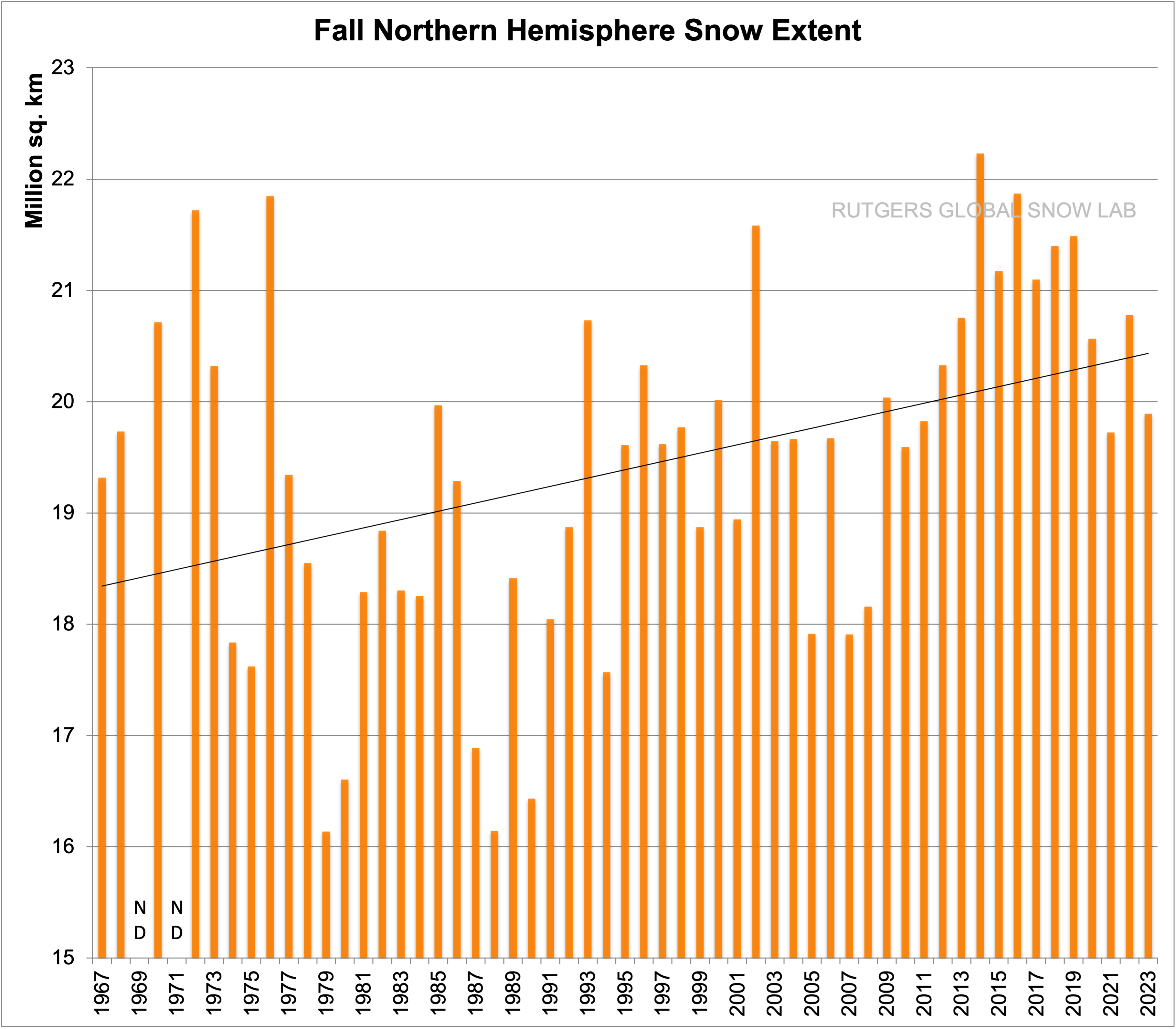
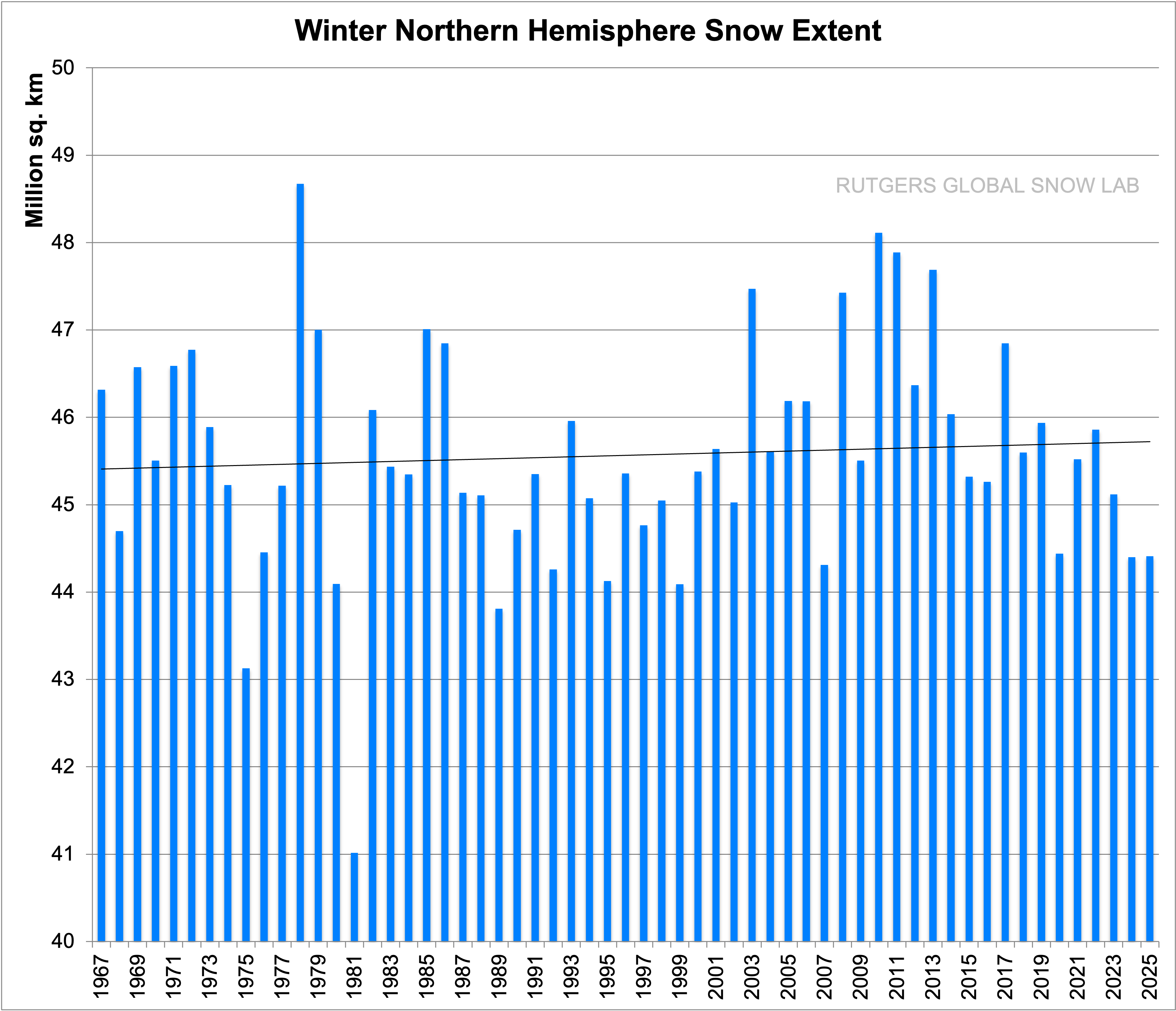
The lowest peak solar EMR coincides with historically low recorded temperatures in the NH as well as other evidence of a cold period commonly known as the Little Ice Age. The NH has been warming now for at least 200 years based on the slow rise in sea level over the past two centuries. Autumn snowfall and extent across the NH has been trending up for at least 70 years consistent with warmer NH ocean surface in late September. The maximum extent of snow coverage is also trending up. The Southern Ocean has already started to cool as the SH peak solar EMR declines.
The region with the most rapid rise in seasonal temperature is the Greenland Plateau in January; displayed in Chart 12.
The trend over the satellite era is upward at 9.1C/century. This can only be the result of increased winter ocean air advection resulting in increased snowfall. The elevation of the plateau has indeed increased 170mm in the past decade. Hindcasting in the CSIRO ACCESS model with CMIP6 SSP585 emissions scenario for the same region yields a January trend of just 3.9C/century. This highlights the inability of the ACCESS model to predict observed changes in the region exhibiting the most warming since 1980.
The proportion of ocean surface reaching 30C is increasing as the NH ocean surface warms up in response to increasing peak ToA solar EMR. The ocean area reaching 30C in April, before the Indian monsoon sets in, has increased by 30% over the two decades from 2003 to 2023. This trend will continue due to the increasing peak solar intensity across the NH.
Climate has always changed and will continue to change. Climate modellers are not providing any useful insight into why climate has changed. The ACCESS model produces unphysical nonsense that has no relationship to observations or even produces plausible projections.
The Author
Richard Willoughby is a retired electrical engineer having worked in the Australian mining and mineral processing industry for 30 years with roles in large scale operations, corporate R&D and mine development. A further ten years was spent in the global insurance industry as an engineering risk consultant where he developed an enduring interest in natural catastrophes and changing climate.
The Power and Impact scale rates the storm intensity during the highest impact (they do not have to make “landfall”, just cause the conditions). That has been increased to 9 from 8 (see Power and Impact scale). In cases like Ian, two different impact numbers that were added together – 4 for Florida and 1.75 for the Carolinas. The ultimate impact is Donna in 1960 (4 in Florida, 3 in the Carolinas, and 2 in New England) for a total of 9. A whole season was wrapped into one storm. Note that Canada is not included in this forecast.
These numbers have been upped slightly. I am saying six tropical storm impacts because I believe that when the season is done, the feature that was un-named on Memorial Day weekend off the Southeast Coast that caused a wipe out the holiday weekend in the Carolinas, hurricane-force winds to a Carnival Cruise Ship, and storm force winds on the coast, will get classified. You can’t classify that January system and then let that one go. We do realize this is somewhat of a numbers game and is totally subjective.
So far, NHC has classified five storms. The two African waves set off much hype as they were so early on, but they fell apart. Since Cindy, nothing has developed outside of Africa. That is how it is normally until August. What is interesting is that the pattern is doing it with record-warm water comparable to the busiest of seasons. This further buttresses my argument about how the distortion of the warming can bring down activity if you boil it down to the old Texas A & M rule: Hurricanes are ways to redistribute heat out of the Tropics. If it’s already being done horizontally and vertically (i.e., warm all over), what’s the need for them?
So with five storms already classified and 16 ACE points, we are ahead of that. One of the storms, Don, became a hurricane. Because it was around so long, it had 7 of the 16 ACE points. The January system had 1.4 ACE points. Don did not originate in the Tropics (nor did the January system or what became Arlene). Essentially the African wave season has produced only 7 of the 16 points. If we were only at 7, we would be below normal for the date.
The big fear here is a spray gun season that all comes in a few weeks. 2008 was classic with seven named impact storms in a row, and then none:
1985:
Herein lies the problem. The congregation of tracks may wind up similarly, and the September Sea Level Pressure forecast by the Euro alludes to that. In the same manner, its precipitation forecast from mid-September to November last year hinted at the late-season activity well before the storms that hit were named.
Globally the western Pacific is doing what were saying it was going to do. The El Niño, of course, is raging full scale and is heading to what we said from early in the season:
This is in line with the preseason analogs, which were way, way under our totals. However, the warm Atlantic and the Multivariate Enso index are other factors. The MEI is not responding like the ONI because it incorporates atmospheric aspects, so it means that there is a big disconnect between the observed El Niño (Sea surface temperature-wise SST) and other similar years, likely due to the distortion of the entire global pattern brought about by distorted warming. So we can’t just rely on those analogs. We did not in the preseason, and the MEI gives us reason to believe that while El Niño will limit this season’s potential, it will not chop it down as much as the other strong ones did.
The old PSU rule was the real hurricane season starts August 15 and ends Oct 15. 75% of the ace is in that time span, and so it may be this year. I have made changes to the impact areas where we believe a higher-than-average ACE will occur.
The September ECMWF forecast looks a lot like the Septembers of 1954, 1985, 1989, 2003, 2004, 2005, 2008 & 2017, with the western trough and ridging up through eastern Canada. Scaling prevents the kind of definition that is seen in the actual analog:
The Sea Level Pressure pattern forecast certainly supports it:
The northward shift in the model makes sense compared to the analogs because of El Niño trying to limit features in the Caribbean. So our forecast map is assuming September is going to be a big month. Again the PSU rule of August 15-October 15 is unlike last year, centering the season in the middle. Last year we picked out analog/model correlations and nailed the late-season activity. It will be interesting to see if this is correct.
The spread of landfalling majors in these years ranges from Harvey on the western flank in 2007 to Carol and Edna in 1954 to the east (Juan, if you count 2003 in Canada).
It is interesting to note how the last three seasons have worked versus this one. 2020 was a wild start to finish. 2021 was early, and 2022 was late. This one is in the middle. So this turns into a “bang for the buck forecast”. I have upped the majors to 1-2 hits. If there is a spray of 5 or 6 storms impacting the U.S., three or four hurricanes, and 1-2 majors, it would mean the Power and Impact points would be higher, so I nudged that up.
The Verdict
The western Pacific is performing according to plan. I think 75% of the ACE may occur in September, and there may be a flurry of activity, depending on the MJO, similar to what we have seen before, where several storms impact the U.S. all at once. The Texas hurricane season should shut down in October, and I suspect after October 15, the rest of the U.S. will too, but who knows what will get named out in the middle of nowhere that may head for Europe?
This is actually a pretty threatening impact forecast. We need to watch the MJO. So far, we have been saved by western Pacific activity, as development there usually means the Atlantic is quiet. They are way ahead of the game this season. The quiet in the Atlantic is not likely to last, and there is a chance that the current quiet will turn into a riot for a few weeks; so far there is nothing on the horizon but rumors of storms, but later this month and especially in September, that should all change.
Note that next year may be a doozy of a season. I believe this is a bounce-back El Niño in response to the longest and strongest MEI El Niño on record, so we should collapse it and go back to a La Niña base state. SSTs will remain warm, and so that may be a season number-wise (at least for totals) two times higher than this year.
Joe Bastardi is a pioneer in extreme weather and long-range forecasting. He is the author of “The Climate Chronicles: Inconvenient Revelations You Won’t Hear From Al Gore — and Others” which you can purchase at the CFACT bookstore.
His new book The Weaponization of Weather in the Phony Climate war can be found here. phonyclimatewar.com
A recent Forbes article claims that the recent shortage of the popular hot sauce “Sriracha” is likely due to climate change. This is false. Natural weather patterns in the region of Mexico Sriracha’s chili peppers are grown are not due to the modest warming the earth has experienced over the past decades. Furthermore, a few years of poor production in one region is not evidence of a long-term impact.
The article, “Why Sriracha Prices Are Surging, And Why Climate Change Might Have Something To Do With It,” claims that a production shortage of the chili peppers used by the Hoy Fong company to make sriracha hot sauce is due to “an ongoing drought exacerbated by human-caused climate change,” as well as “back-to-back La Niña events that prolonged it in northern Mexico, where the chilis are grown.”
The recent drought in the southwestern United States and northern Mexico has been held up as proof of the impacts of climate change by many alarmists. The Forbes article repeats the claim that the drought, which has now abated according to the U.S. Drought Monitor, is part of the “the driest 22-year period in more than 1,200 years,” quoting a popularly cited study in Nature Climate Change.
In the first post, Watts explains that the study authors narrowly defined “megadrought” in order to compose the narrative that the recent 22-year dry spell was the worst in 1200 years.
Other studies that also use tree ring data, like the Nature Climate Change paper, show much longer and more intense dry periods in the southwest in the past, especially in the Middle Ages. (See figure below)
Since the recent drought is not outside of natural variability, what about the triple-dip La Niña events?
La Niña is also a natural event, not due to climate change. It is the cool-phase counterpart to the warming phase of the El Niño-Southern Oscillation (ENSO), a naturally-occurring sea surface temperature pattern in the Pacific. La Niña involves cooler-than-normal water temperatures, and usually causes unusually dry weather in the southwestern United States and Mexico, and unusually wet weather in Western Pacific areas like Australia. While the three La Niña events in a row is a rare situation, it’s not unprecedented. La Niña is not getting more intense due to climate change, as covered by Climate Realism, here, for example. (See figure below)
The Huy Fong sriracha sauce got its start on a small scale in the mid-1980s, meaning the company should have been around for previous extended La Niña events, but it is unclear the company was producing such a volume of hot sauce, or even getting peppers from the same region, during that period.
On the agricultural side of the claim, publicly available data from the United Nations Food and Agriculture Organization (FAO) for chilies and other peppers grown in Mexico show indeed there has been a recent decline in production, since about 2019 through 2021, and presumably into 2022, which corresponds with the recent La Niña events. (See figure below)
Chili pepper production in Mexico hit an all-time production record high as recently as 2018, and in fact saw production records broken fifteen times between 1990 and 2020, a timeframe which has supposedly seen warming which alarmists claim is “catastrophic.”
Fortunately, with the forecasted return of the warmer El Niño this year, the issues hindering Huy Fong’s chili source in northern Mexico should decline, if indeed La Niña conditions were to blame instead of some unmentioned agricultural issues.
Regional weather patterns and agricultural shortages are not proof of impacts from climate change, nor can climate change be blamed for those shortages.
Data does not indicate that the regional weather in Northern Mexico since 2019 is more extreme because of the modest warming of global average surface temperature, nor are chili pepper crops in general in any danger. If they were, one would expect evidence to show up in agricultural production data over time.
In fact, crop production woes of a single hot sauce company are not indicative of any kind of widespread climate chaos, or weather issues. Even if Huy Fong sriracha sauce is not currently on shelves, other companies’ similar sriracha chili sauces that have the same ingredients are still widely available, and Forbes would have been wise to point that out, instead of doom-peddling over a particular brand.
Linnea Lueken is a Research Fellow with the Arthur B. Robinson Center on Climate and Environmental Policy.
While she was an intern with The Heartland Institute in 2018, she co-authored a Heartland Institute Policy Brief “Debunking Four Persistent Myths About Hydraulic Fracturing.”
This satellite image taken at 9:30 a.m. EDT on Friday, Oct. 23, 2015, and released by the National Oceanic and Atmospheric Administration shows Hurricane Patricia. Hurricane Patricia headed toward southwestern Mexico Friday as a monster Category 5 storm, the strongest ever in the Western Hemisphere that forecasters said could make a “potentially catastrophic landfall” later in the day. (NOAA/RAMMB/CIRA via AP)
The 2022 edition of this post is the 2nd-most viewed here at THB. The 2023 version, below, is completely new and with updated data and analysis. Please help get the word out by clicking share and sending to your favorite social media outlets. And if you’d like you can also share it with you favorite reporter on the climate beat!
Today is the official start to the 2023 hurricane season in the North Atlantic. Over the past few decades the media has increasing celebrated every hurricane as an indicator of climate change — whether juiced, intensified, linked, fueled — pick your favorite. Typically lost in the apocalyptic narrative has been actual science and data.
Below are five important conclusions from the scientific literature that are rarely, if ever, found in coverage of hurricanes.
1. The scientific consensus on hurricanes and climate change is clear and consistent.
In short —trends in hurricane activity outside the range of documented variability have not been detected, nor is there high confidence in connections of hurricane behavior to greenhouse gas emissions.
Don’t take it from me. Here is what the National Oceanic and Atmospheric Administration (NOAA) said this month:
[F]or Atlantic hurricane activity, the attribution observed changes to increasing greenhouse gases is not yet assessed as highly confident, apart from impacts related to sea level rise. Observed hurricane data generally either do not show clear centennial-scale trends or do not cover enough years to assess century-scale trends. Pronounced multidecadal variations typically dominate over long-term (centennial-scale) trends over decadal timescales for Atlantic hurricanes.
NOAA’s assessment of scientific understandings is consistent with that of the most recent assessment of Intergovernmental Panel on Climate Change (IPCC):
[T]here is still no consensus on the relative magnitude of human and natural influences on past changes in Atlantic hurricane activity, and particularly on which factor has dominated the observed increase (Ting et al., 2015) and it remains uncertain whether past changes in Atlantic TC activity are outside the range of natural variability.
There are hypothesized effects — such as the rapid intensification of storms or enhanced precipitation — but NOAA concludes that “confident quantitative attribution” of changes in the phenomena to greenhouse gas emissions or internal variability “remains an unsettled topic of research.” The media often conflates hypotheses with firmly established conclusions.
“an anthropogenic influence has not been formally detected specifically for hurricane-related precipitation”
For storm numbers, rapid intensification probability and extreme precipitation, “climate change detection/attribution studies are not yet definitive for hurricane activity metrics, and more research is needed for more confident conclusions.”
“it is premature to conclude with high confidence that human-caused increases in greenhouse gases have caused a change in past Atlantic basin hurricane activity that is outside the range of natural variability”
There is little ambiguity in the current state of the science of hurricanes and climate change.
2. Hurricane landfalls along the continental U.S. show no trends since at least 1900.
I’ve not seen either dataset appear in the legacy media — well, except once, when Bill Nye “The Science Guy” printed out my graph and took a sharpie to it on CNN, apparently to “correct” the data to show an increase!
How to turn “No INcrease” into an “Increase” — Use a Sharpie!
3. Development and growth are sufficient to explain why hurricane damage has increased dramatically
Spot the change
While climate change is typically the focus of attention when hurricanes make landfall, there is no debate that the single biggest factor driving increasing damage from storms is development — the growth of buildings and amount of wealth exposed to storms.
As blindingly obvious as this may seem, it is routinely ignored in the promotion of NOAA’s “billion dollar disaster” campaign.
For more than 25 years, my colleagues and I have estimated how much damage that storms of the past would cause if they occurred with contemporary levels of development. Our methods offer a useful independent estimate of such losses that can be compared to the results of catastrophe models.
Here are estimates of the top 25 most costly hurricanes (continental US) had each storm occurred in 2023. The 1926 Great Miami Hurricane approaches $300 billion.
The figure below shows an estimate how much damage would occur in 2023 if each past hurricane season occurred this year.You might be able to eyeball a small increasing trend since 1900 — trends are sensitive to time period, e.g., start in the 1970s and you’ll find an increasing trend, start in 1920s and find no trend.
Compare our results (above) with independent estimates from a catastrophe model (below). They are pretty similar, but there are some differences (like the 1930s and 1940s).
4. Climate change is important, but far more important for understanding trends and causes of increasing disaster costs is societal change, especially what we build, where we build and how we build.
It is not just hurricanes. Damage associated with extreme weather events has increased dramatically in recent decades. The reason? More people with more stuff.
The map and graph below show population increases in different regions of the United States. We like to live where risks are high — in particular, East and Gulf Coasts (hurricanes) and California (fires and earthquakes).
The figure below shows that the number of houses has increased in parallel to the increases in population. More houses mean more damage.
It is not just the numbers of houses, but their sizes have increased as well, reflecting growing affluence. Larger houses are filled with more stuff, and more stuff means more damage when an extreme event occurs. The figure below shows that the average U.S. home increased by about 1,000 square feet (~60%) over about 40 years.
5. The largest climate signal — by far — in the damage record of U.S. hurricanes is ENSO.
There are only a few times in my career when I can say that I actually discovered something fundamentally new. Once was in the 1990s when, along with Chris Landsea, we discovered a very strong signal in U.S. hurricane damage based on the phases of the El Niño/Southern Oscillation or ENSO.
In a nutshell, during the peak of the hurricane season (that is August-October) El Niño conditions have the fewest landfalls and damage and La Niña conditions have the most, with neutral years falling in between. You can see this in the figures below.
The panel on the left shows that there are almost twice as many hurricane landfalls in La Niña years compared to El Niño years. The panel on the right shows an even larger difference in median damage. But be careful — these are summary statistics with considerable variation and damaging storms can happen in any phase of ENSO.
With hurricane season around the corner, Stanley Goldenberg, a scientific expert in hurricane research, joins us for the newest episode of Climate Change Roundtable. Goldenberg joins host Anthony Watts and expert panelist Linnea Lueken to discuss what the current data and forecasts indicate for the upcoming hurricane season.
Readers may recall that last year, NOAA and media outlets touted a very active hurricane season that turned out (thankfully) to be a dud. What impact will the end of La Niña and return of El Niño have this year? What other factors are at play? Join us to find out!
Climate Change Roundtable airs every Friday at 12pm CT. Tune in to the LIVE program to ask questions to put panelists, have your comments featured on the show, and interact with like minded viewers.
The New Pause has lengthened by a further two months to 8 years 11 months. The least-squares linear-regression trend on the UAH monthly satellite global-temperature dataset for the lower troposphere shows no global warming at all from June 2014 to April 2023.
As usual, the start and end dates of the New Pause are not cherry-picked. The end date is the most recent month for which data are available; the start date is the farthest back one can reach and still find a zero trend. It is what it is.
For comparison, here is the entire dataset for 44 years 5 months since December 1978. It shows a long-run warming rate equivalent to 1.3 K/century, of which 0.3 K has already occurred since January 2021, leaving just 1 K to go (on the current trend) until 2100, by which time reserves of coal, oil and gas will be largely exhausted.
We are no longer in la Niña conditions. They ended in March 2023, when the temperature of the Niño-3.4 region of the equatorial eastern Pacific rose above –0.5 K:
One reason why el Niño-watchers predict that an new el Niño is on its way is the gradual westward extension of the warm pool in in the top 300 m of the tropical Pacific, the hallmark of el Niño, as NOAA’s image shows –
NOAA thinks there is a 62% chance of an el Niño developing. If it does develop, it will probably bring the latest Pause to an end. Nevertheless, these long Pauses are a visual demonstration of the now-undeniable fact that the rate of global warming predicted by IPCC in 1990 has proven to be greatly in excess of the subsequent outturn.
First, note that the 0.136 K/decade trend in the 400 months (exactly a third of a century) since 1990 is barely above the 0.133 K/decade trend since 1978. Notwithstanding business-as-usual increases in emissions, very little acceleration in the global-warming rate is evident.
In fact, IPCC’s midrange prediction in 1990 of 0.3 K/decade business-as-usual warming since that year exceeds the 0.136 K/decade real-world global warming rate observed since then by a startling 120%. Indeed, even the 0.2 K/decade lower bound of IPCC’s 1990 prediction exceeds observed reality by close to half. Yet policy is being made by scientifically-illiterate governments on the basis of the 0.5 K/decade upper-bound prediction, which exceeds observed reality by a shocking 268%.
Annual emissions are indeed tracking the business-as-usual Scenario A in IPCC (1990). The growth is almost double that which was predicted under Scenario B. It is now clear that IPCC’s conversion of emissions to forcings, and thus its predictions of global warming, had been grossly overwrought and that, therefore, the threatened “climate emergency” is absent.
We’ve had a La Niña for nearly three years. But now it has officially ended, and ENSO has moved into its neutral phase, the “La Nada”.[1] The La Niña event lasted three winters in a row, something that has only occurred twice before in modern times: 1973–1976 and 1998–2001. Both of these followed in response to a very strong El Niño.
The La Niña that has now ended, on the other hand, came after the more neutral winter of 2019/20.
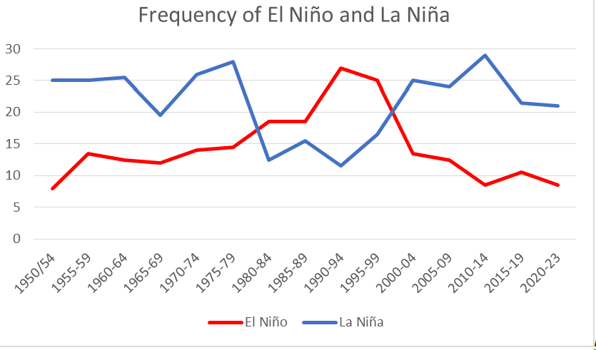
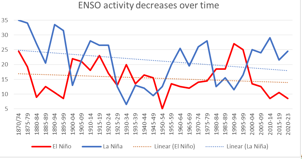
Figure 1. Number of months with each ENSO phase for five-year periods from 1950 – 2023
The number of months that we have had each ENSO phase in the last 74 years is shown in Figure 1. The La Niñas are more frequent than the El Niños. Interestingly, the opposite was true during the rapid warming we had from 1975 – 1999, when El Niños were more common. But then it reverts back again around 1998/99. Is there a pattern here?
It is established in climate science that the climate underwent a profound shift in 1976/77, related to the ocean currents.[2] In IPCC AR4, they write: “The 1976–1977 climate shift in the Pacific, associated with a phase change in the PDO from negative to positive, was associated with significant changes in ENSO evolution.” The Pacific Decadal Oscillation (PDO) shifted from a ‘cold’ to a ‘warm’ phase during these two years.[3] The ENSO also became dominated by the El Niño phase, which is characterized by warmer temperatures.[4] These changes affected the global climate, and a rapid warming began.
But what happened in the years just before 2000? As seen in Figure 1, ENSO reverts to being dominated by the ‘colder’ La Niña at that time.
Interestingly, the PDO also reverts to its cold phase in 1998–1999.
Are we seeing a shift to a colder phase in the climate here?
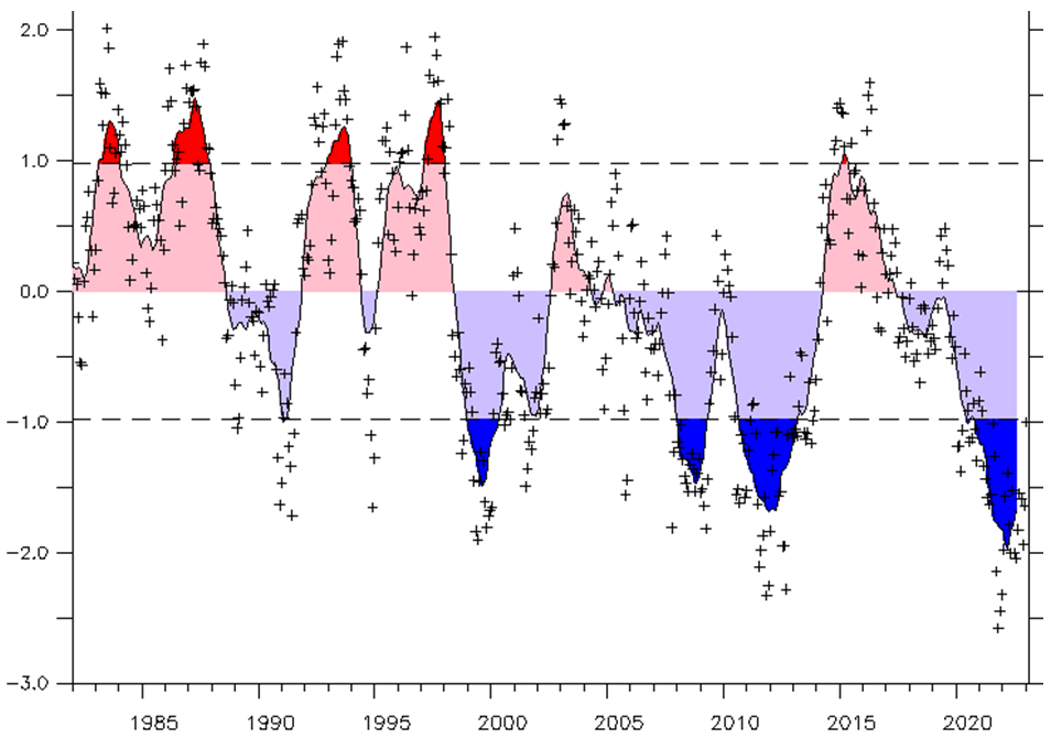
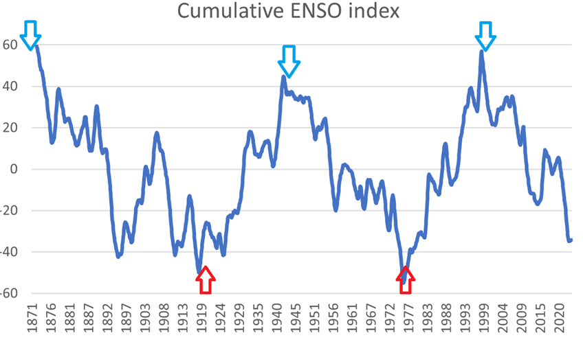
To analyze this confluence, we need to look at longer time series. Luckily, there is monthly ENSO data back to 1871.[5] In Figure 3 I have plotted the number of months of each active ENSO phase, collated in 5-year periods.
Figure 3. Number of months with the respective ENSO phase, and trend lines. Five-year periods from 1871 to 2023.
An oft-repeated forecast is that global warming will lead to more frequent and stronger El Niños, and a generally more active ENSO.[6][7]
However, we see no signs of this in the empirical evidence. On the contrary, the trend is in long-term decline for both ENSO phases.
Figure 4. De-trended, cumulative total of the MEI ENSO index from 1871–2023. Approximate turning points of the PDO are marked with arrows.
The longer-term natural variation for ENSO is clearly seen if we look at the cumulative total of the MEI coefficient in Figure 4. MEI varies around zero, it is positive when we have El Niño and negative for La Niña. The cumulative total is what we get when we start with the first value, and then add each succeeding value to the previous total. The advantage of using the cumulative total is that it lays bare the timing of the fundamental shifts in the system.
We see that ENSO has two distinct long-term states: up or down. Furthermore, the shift from one to the other seems to be threshold-based.
We have a negative cumulative ENSO trend from 1871–1920 since those years saw a strong dominance of La Niña events. During this period, global temperatures were declining.
In contrast, the period 1920–1944 saw a rapid increase in temperatures and is dominated by El Niño events, as seen in Figure 3. Then comes the cold period from 1945–75, dominated by La Niña events and a declining cumulative ENSO index. After that we have a positive trend until 1997/98, with a rapid increase in global temperatures.
Interestingly, these turning points in ENSO coincide with the reversal of the long-term PDO (marked by arrows in the figure).
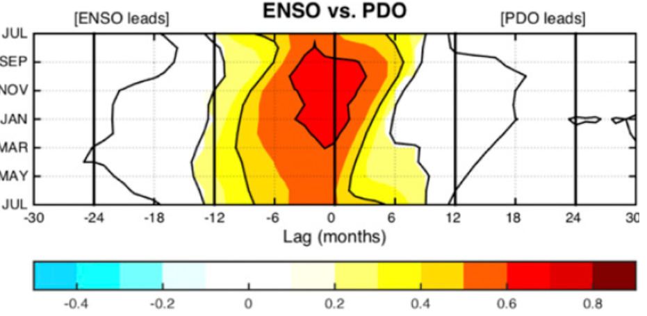
Figure 5. ENSO often leads the PDO, especially in the La Niña phase.
That ENSO and PDO are climatically connected is well known. Usually, it’s the ENSO that leads the shifts in the PDO cycle, see Figure 3d in [4].
The standard explanation for the 1976/77 climate shift is that the period before that was cold due to a lot of aerosols in the atmosphere that reduced the amount of warming solar radiation.[8] But around those years, the warming forcing from CO2 took over the cooling aerosols, the narrative goes.
Cannot be explained by CO2
CO2 has been increasing monotonically throughout the modern era, and aerosols increased monotonically up until about 1980.[9] Thus, it is unreasonable that more than one of the climate shifts in the modern era can be explained by the relationship of CO2 to aerosols.
It is more likely that climate shifts are due to confluences between different natural variations that we can observe in various climate indices. We can see, for example, that also the long-term variations in the AMO and SOI show similar turning points to the cumulative ENSO and the PDO, as in figure 4.[3]
Are we currently in a shift towards a colder climate?
One indication of that, is that we’re still quite far away from the previously observed threshold levels in the cumulative ENSO index.
A note on ENSO indexes
The ENSO variation between La Niña/Neutral/El Niño is defined by different indices. The traditional one is called NINO 3.4, which picks up temperature differences in two regions in the Pacific ocean. If the average value is below -0.5 degrees three months in a row, it is classified as La Niña, above 0.5 it is El Niño, where the numbers refer to the temperature deviation in two areas of the Pacific Ocean.
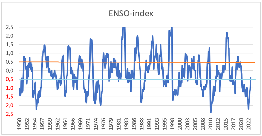
The MEI.v2, which is used in this article, is an alternative index, which weighs together five different variables: sea surface air pressure, sea surface temperature, zonal and meridional components of the surface wind, and outgoing longwave radiation.
The MEI uses the same numerical scale as for Nino 3.4, but the amplitude differs. MEI.v2 exists from 1979 and the earlier MEI index exists from 1950, and in a reconstruction back to 1871. This is what the raw data looks like for the MEI.v2 index:
[7] Increased ENSO sea surface temperature variability under four IPCC emission scenarios, Cai and 5 co-authors, Nature 2022, https://doi.org/10.1038/s41558-022-01282-z
Global warming, climate change, all these things are just a dream come true for politicians. I deal with evidence and not with frightening computer models because the seeker after truth does not put his faith in any consensus. The road to the truth is long and hard, but this is the road we must follow. People who describe the unprecedented comfort and ease of modern life as a climate disaster, in my opinion have no idea what a real problem is.
We use cookies to personalise content and ads, to provide social media features and to analyse our traffic. We also share information about your use of our site with our social media, advertising and analytics partners. View more
Cookies settings
Accept
Privacy & Cookie policy
Privacy & Cookies policy
Cookies list
Cookie name
Active
Wer wir sind
Textvorschlag: Die Adresse unserer Website ist: https://climate-science.press.
Kommentare
Textvorschlag: Wenn Besucher Kommentare auf der Website schreiben, sammeln wir die Daten, die im Kommentar-Formular angezeigt werden, außerdem die IP-Adresse des Besuchers und den User-Agent-String (damit wird der Browser identifiziert), um die Erkennung von Spam zu unterstützen.
Aus deiner E-Mail-Adresse kann eine anonymisierte Zeichenfolge erstellt (auch Hash genannt) und dem Gravatar-Dienst übergeben werden, um zu prüfen, ob du diesen benutzt. Die Datenschutzerklärung des Gravatar-Dienstes findest du hier: https://automattic.com/privacy/. Nachdem dein Kommentar freigegeben wurde, ist dein Profilbild öffentlich im Kontext deines Kommentars sichtbar.
Medien
Textvorschlag: Wenn du ein registrierter Benutzer bist und Fotos auf diese Website lädst, solltest du vermeiden, Fotos mit einem EXIF-GPS-Standort hochzuladen. Besucher dieser Website könnten Fotos, die auf dieser Website gespeichert sind, herunterladen und deren Standort-Informationen extrahieren.
Cookies
Textvorschlag: Wenn du einen Kommentar auf unserer Website schreibst, kann das eine Einwilligung sein, deinen Namen, E-Mail-Adresse und Website in Cookies zu speichern. Dies ist eine Komfortfunktion, damit du nicht, wenn du einen weiteren Kommentar schreibst, all diese Daten erneut eingeben musst. Diese Cookies werden ein Jahr lang gespeichert.
Falls du ein Konto hast und dich auf dieser Website anmeldest, werden wir ein temporäres Cookie setzen, um festzustellen, ob dein Browser Cookies akzeptiert. Dieses Cookie enthält keine personenbezogenen Daten und wird verworfen, wenn du deinen Browser schließt.
Wenn du dich anmeldest, werden wir einige Cookies einrichten, um deine Anmeldeinformationen und Anzeigeoptionen zu speichern. Anmelde-Cookies verfallen nach zwei Tagen und Cookies für die Anzeigeoptionen nach einem Jahr. Falls du bei der Anmeldung „Angemeldet bleiben“ auswählst, wird deine Anmeldung zwei Wochen lang aufrechterhalten. Mit der Abmeldung aus deinem Konto werden die Anmelde-Cookies gelöscht.
Wenn du einen Artikel bearbeitest oder veröffentlichst, wird ein zusätzlicher Cookie in deinem Browser gespeichert. Dieser Cookie enthält keine personenbezogenen Daten und verweist nur auf die Beitrags-ID des Artikels, den du gerade bearbeitet hast. Der Cookie verfällt nach einem Tag.
Eingebettete Inhalte von anderen Websites
Textvorschlag: Beiträge auf dieser Website können eingebettete Inhalte beinhalten (z. B. Videos, Bilder, Beiträge etc.). Eingebettete Inhalte von anderen Websites verhalten sich exakt so, als ob der Besucher die andere Website besucht hätte.
Diese Websites können Daten über dich sammeln, Cookies benutzen, zusätzliche Tracking-Dienste von Dritten einbetten und deine Interaktion mit diesem eingebetteten Inhalt aufzeichnen, inklusive deiner Interaktion mit dem eingebetteten Inhalt, falls du ein Konto hast und auf dieser Website angemeldet bist.
Mit wem wir deine Daten teilen
Textvorschlag: Wenn du eine Zurücksetzung des Passworts beantragst, wird deine IP-Adresse in der E-Mail zur Zurücksetzung enthalten sein.
Wie lange wir deine Daten speichern
Textvorschlag: Wenn du einen Kommentar schreibst, wird dieser inklusive Metadaten zeitlich unbegrenzt gespeichert. Auf diese Art können wir Folgekommentare automatisch erkennen und freigeben, anstatt sie in einer Moderations-Warteschlange festzuhalten.
Für Benutzer, die sich auf unserer Website registrieren, speichern wir zusätzlich die persönlichen Informationen, die sie in ihren Benutzerprofilen angeben. Alle Benutzer können jederzeit ihre persönlichen Informationen einsehen, verändern oder löschen (der Benutzername kann nicht verändert werden). Administratoren der Website können diese Informationen ebenfalls einsehen und verändern.
Welche Rechte du an deinen Daten hast
Textvorschlag: Wenn du ein Konto auf dieser Website besitzt oder Kommentare geschrieben hast, kannst du einen Export deiner personenbezogenen Daten bei uns anfordern, inklusive aller Daten, die du uns mitgeteilt hast. Darüber hinaus kannst du die Löschung aller personenbezogenen Daten, die wir von dir gespeichert haben, anfordern. Dies umfasst nicht die Daten, die wir aufgrund administrativer, rechtlicher oder sicherheitsrelevanter Notwendigkeiten aufbewahren müssen.
Wohin deine Daten gesendet werden
Textvorschlag: Besucher-Kommentare könnten von einem automatisierten Dienst zur Spam-Erkennung untersucht werden.


